I’m opting for “progress over perfection” but perhaps you’ve seen the phrase as “progress not perfection.” Same vibe.
I’m adding it to my mental toolbox because of two recent examples.
Accessibility expert Meryl Evans recently shared an example on LinkedIn:
This scenario is exactly why I’ve been pushing for progress, not perfection.
A dear friend posted images on social media that provided excellent #accessibility tips. However, the images did not have a strong enough contrast.
We happened to get on a video call and I mentioned the color contrast. I told her about a tool that makes it easy to know if the colors past the contrast ratio.
The designer was working with my friend’s brand colors. Both are learning accessibility as they go. She said she will share that with her graphics designer.
And this friend is an awesome supporter of accessibility and inclusion. She’s always pushing for it.
Well, someone saw the images on social media that were posted before we talked. And they responded with a harsh message.
It upset my friend. Of course, she felt awful. She’s one of the kindest and sweetest people I know. Fortunately, this didn’t deter her from continuing to push for accessibility and learn about it herself.
The next person may not respond like she did. These harsh words can have the opposite effect and someone ends up not bothering with accessibility at all.
We. Don’t. Know. Everything.
Accessibility is huge! What may be obvious to you may not be obvious to someone else.
I’m also learning. I don’t know how to do everything in accessibility. Far from it. WCAG is challenging for me to understand. ARIA and I aren’t on speaking terms because I can’t understand ARIA 🤣
That’s why I’ve been pushing progress, not perfection. It’s a kinder approach. And we have to keep in mind that someone may not know what they don’t know and needs a gentle education.
Instead of snapping, educate. Something to the effect of:
“Hey, I appreciate your efforts with accessibility. I thought you might want to know that these images don’t have a strong enough color contrast. You can check color contrast with a free tool like Colour Contrast Analyser.” (No, I didn’t suddenly start speaking with a UK accent. That’s the name of it.) https://lnkd.in/eYrhYvvB
It’s the ol’ catch more flies with honey than vinegar thing. I don’t love this idiom, but I haven’t found a better one.
Also, please suggest a few things to improve instead of everything. I know when I look at a very messy room, I turn around and leave. It’s overwhelming. But if there are a few boxes in the room, then it’s more manageable and I’ll move them right away.
Let’s not get all A11y catty 😸
Please educate. Please be kind.
#ProgressNotPerfection
#Accessibility
#A11y
#MerylMots 👈 Are you following this hashtag and this account?
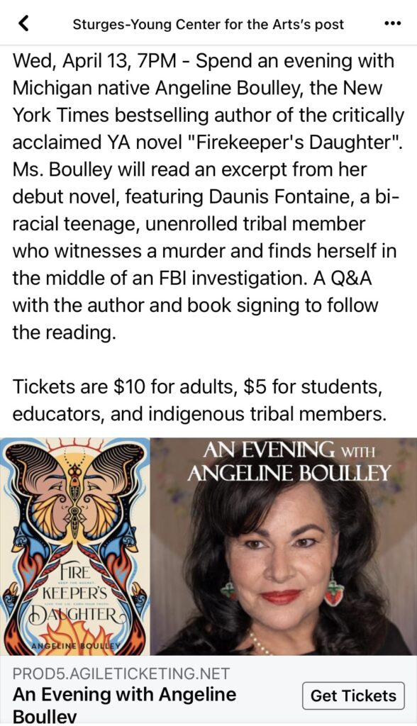
Example #2 is from how the Sturges-Young Center for the Arts recently handled constructive feedback to a Facebook ad promoting an April 13 event when they will be hosting Firekeeper’s Daughter author Angeline Boulley. The original ad listed “Tickets are $10 for adults, $5 for students, educators, and indigenous tribal members.”
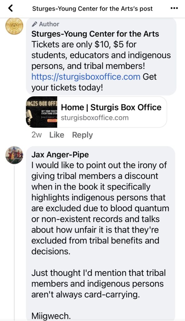
Someone pointed out a problem with the discounted-pricing phrasing:
I would like to point out the irony of giving tribal members a discount when in the book it specifically highlights indigenous persons that are excluded due to blood quantum or non-existent records and talks about how unfair it is that they’re excluded from tribal benefits and decisions.
Just thought I’d mention that tribal members and indigenous persons aren’t always card-carrying.
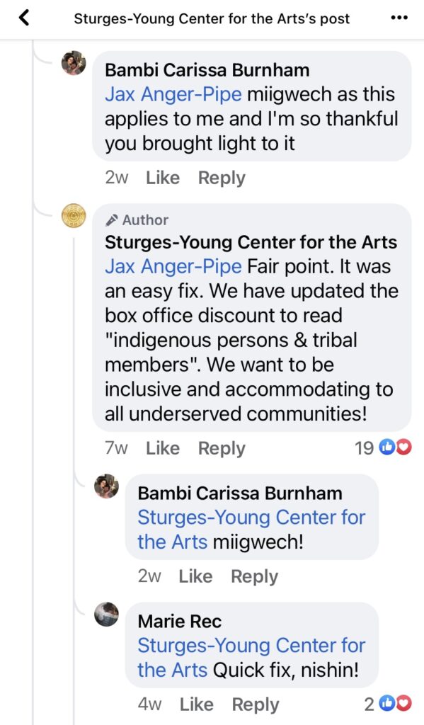
How did the Center respond? With understanding and progress.
Fair point. It was an easy fix. We have updated the box office discount to read “indigenous persons & tribal members”. We want to be inclusive and accommodating to all underserved communities!
The other commenters were appreciative.


Healthy reminders of how we’re all in this together and can make progress with respectful conversations and open minds.
