Michigan’s Governor filed a supplemental brief to the Michigan Supreme Court while the Court considers her April 7, 2022 Executive Message.
The nicely formatted brief makes for an easier read. Six things stand out.
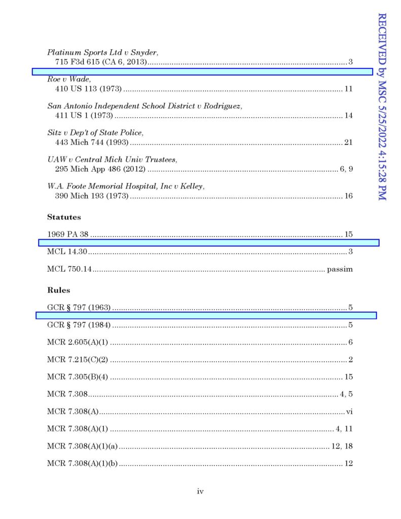
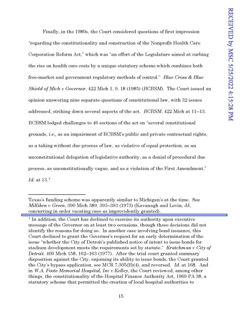
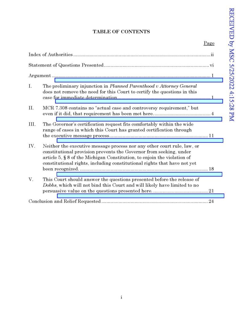
[1] Spacing. Nice spacing is used in the arguments section of the table of contents page, the authorities index, and between footnotes.
Reading speed and understanding plummet when a page lacks white space. Writing expert Roy Peter Clark shares how “white space is a form of punctuation, glowing lights that reveal the parts. It also ventilates the page and releases the pressure of concentration, leading to a more inviting response from the user.”
The Governor’s supplemental brief gets it right.
[2] Within the table of contents page, the arguments are plain-text, not screaming all-caps bold.
ALL-CAP TEXT IS HARDER TO READ. Ruth Anne Robbins shares the data from studies proving that all-caps lengthen reading time by 9.5% to 19%. And she devotes a section to “Stop screaming at me in rectangle: Why all capital letters just don’t work” in Painting with print: Incorporating concepts of typographic and layout design into the text of legal writing documents.
Bryan Garner details more in The Winning Brief:
What’s the problem with using all capitals? Because all the characters are uniform in size, letters and even words tend to blend together.
The text letters don’t have what typographers call “ascenders” and “descenders,” the parts of letters that go above (b) and below (p) the line of type.
Words set in all-caps lack distinctive shapes—they’re all just boxcars. Those shapes contribute to our comprehension.
So the consequent difficulties in reading all-caps are largely a physiological matter, not merely a question of taste.
The arguments in the Governor’s supplemental brief are printed like a conversation.
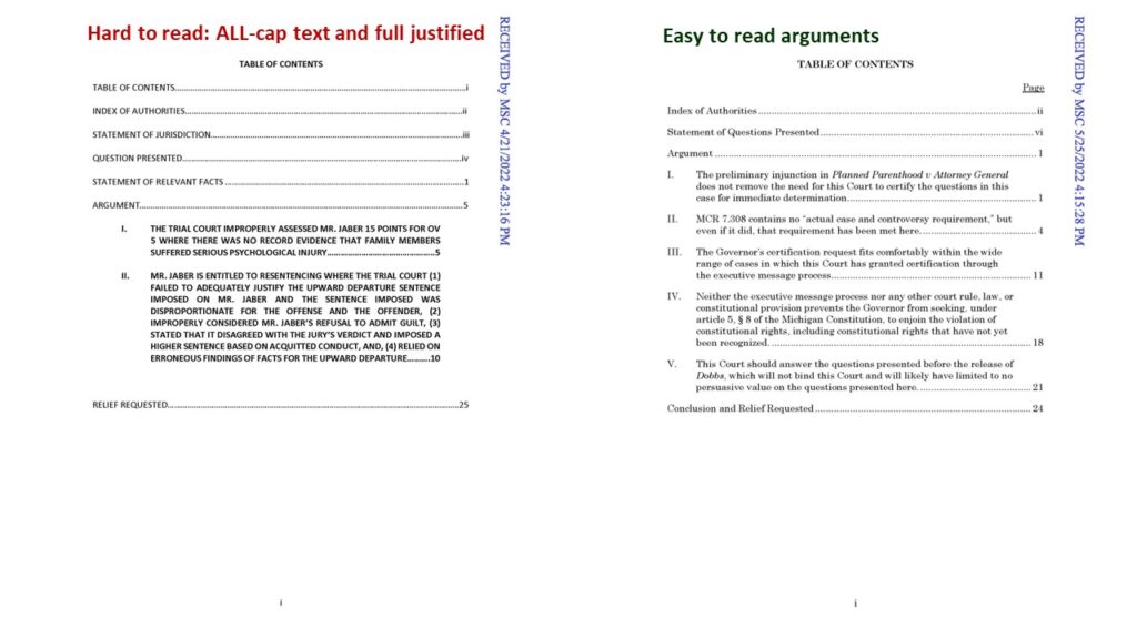
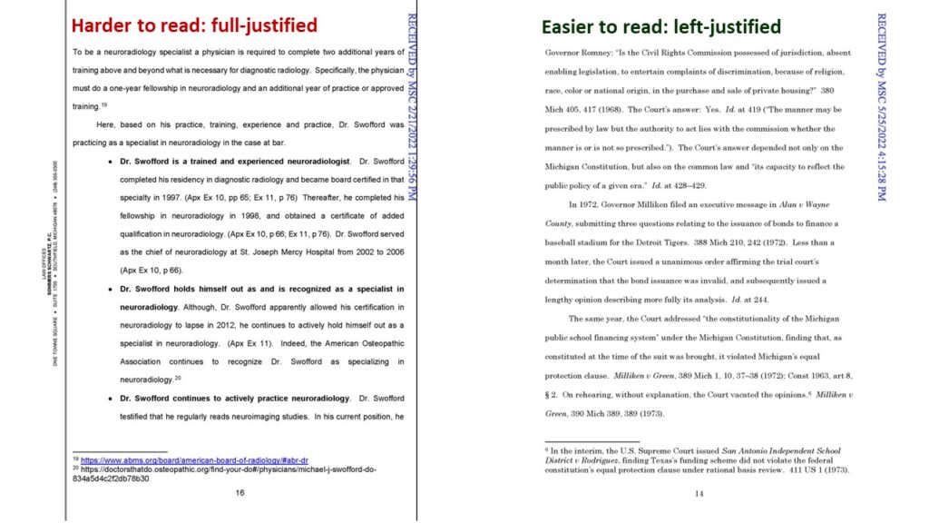
[3] Paragraph text (including in footnotes) is left-justified.
“Left-aligning is more reliable,” Matthew Butterick explains because “word-processor justification can often look clunky and coarse.”
Blame Microsoft Word damns Ellen Lupton, the director of the MFA program in graphic design at the Maryland Institute College of Art in Baltimore and the curator of contemporary design at the Cooper-Hewitt National Design Museum in New York City. She pins down Word’s shortcoming:
The reason that text with justified margins looks bad in a single-column Word document is that subtle word-spacing and letter-spacing algorithms are needed to make justified text look “good,” and Word’s aren’t up to the job.
So it’s not really the column width that’s the problem, but rather limitations in the software.
Many beautiful books are set in single-column justified pages, but they have been properly typeset.
Word documents simply should not be justified.
The Governor’s supplemental brief is consistently left-justified.
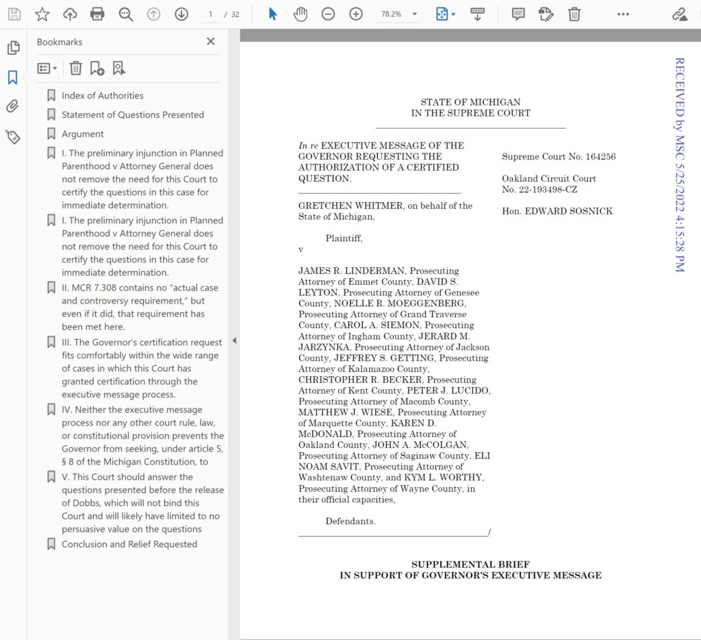
[4] Bookmarks are used and are set to automatically display.
Most users assume that no bookmarks were created if the “Bookmarks Panel” does not display automatically when the .pdf file is opened. That assumption is particularly dispiriting when navigating large .pdf files.
This brief includes beautiful bookmarks and they automatically display when the .pdf file is opened.
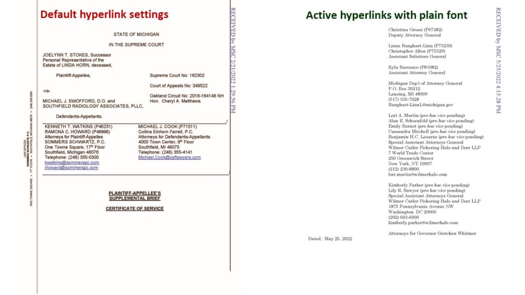
[5] Hyperlinks (for example in listed email addresses) are active but do not appear in a different-colored font.
Microsoft Word users can change the appearance (Style setting) of (followed) hyperlinks and unfollowed hyperlinks. They do not have to be blue, purple (or any other color) or include an underline. Erin Wright explains and shows how here.
The Governor’s brief adjusted its link settings to mirror plain text throughout the brief.
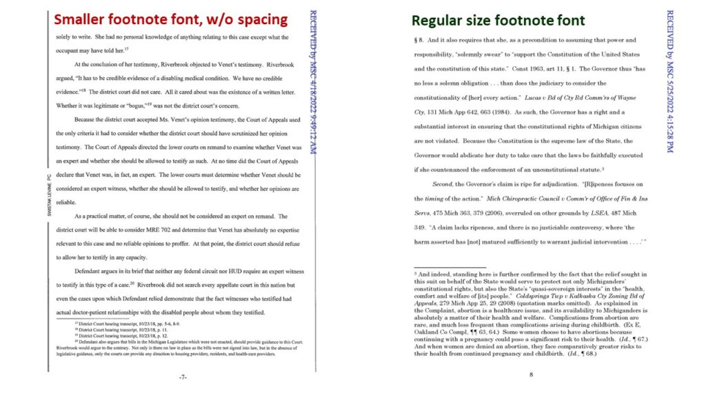
[6] The footnote font remains the same size as the body.
Millions in the United States have impaired vision because of uncorrected refractive error, and many suffer vision impairment even after correction. A great many people cannot read small font or “the fine print.”
At least 12 points (or 16 pixels) font is recommended by the U.S. Department of Health and Human Services. It’s important to remember your audience like counsel did in this federal filing: “This Complaint is submitted in 14-point type to assist Plaintiff and Co-counsel *** who is legally blind.”
If you want your footnotes to be read, then use a font size that is readable, like the Governor did in her brief.
